
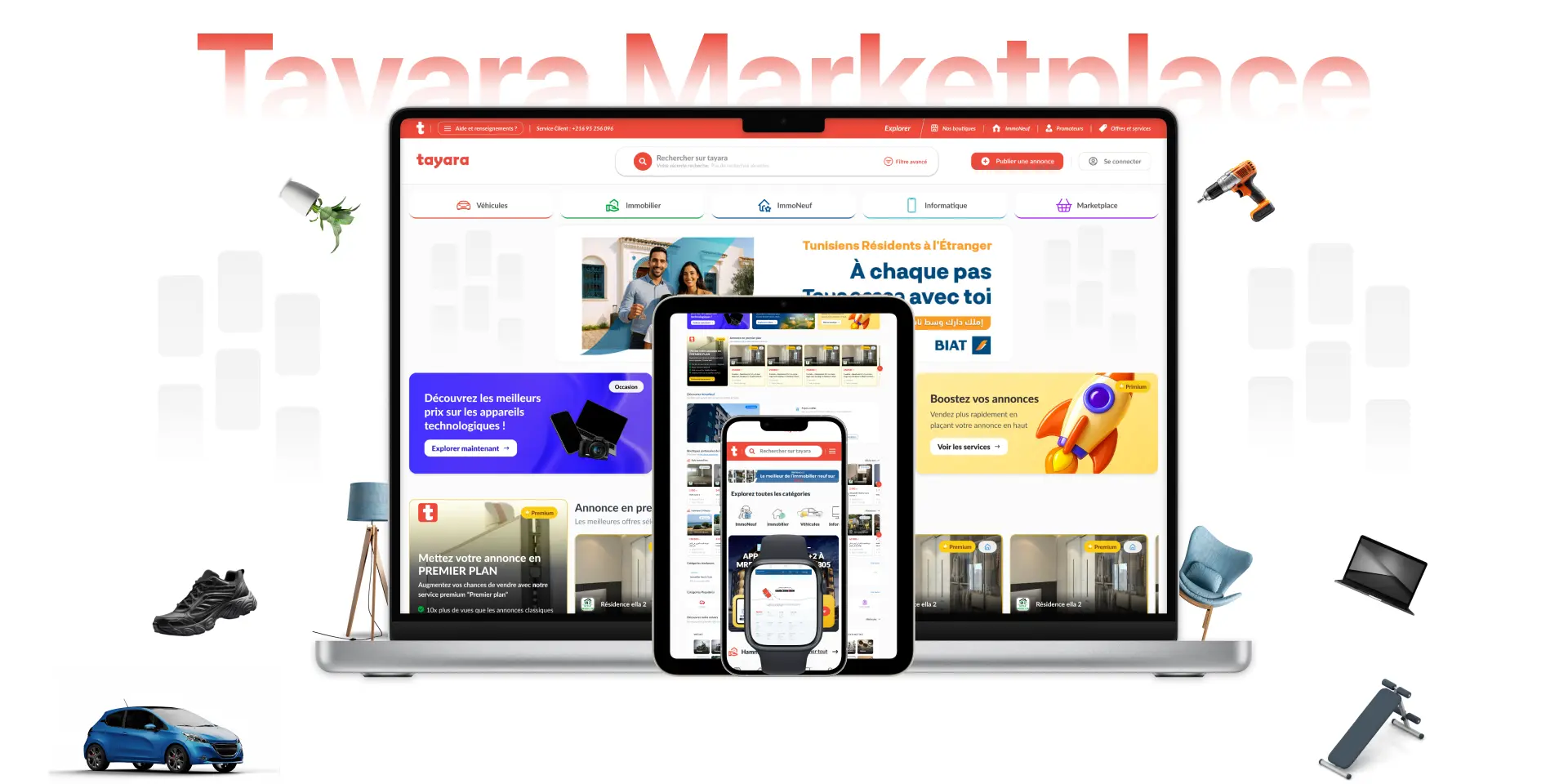
Redesigning Tunisia's #1 Marketplace
Helping millions of Tunisians buy, sell, and rent with more trust, transparency, and speed.
Reading Time
10 minutes
Heads up! This is a detailed case study where I walk through my approach, design thinking, and key insights. It's a bit lengthy, but hopefully worth your time!
For the full story, I'd suggest reading start to finish. But if you want to jump ahead:
Jump to Section
01. Overview
Beyond Design Limits
This case study showcases how I transformed Tunisia's most beloved marketplace from confusion to clarity during a critical growth phase.
Timeline
October 2021 – 2024
Team
11 cross-functional members (PO, CTO, engineers, designer, growth hacker)
Challenge
Redesign Tayara's premium experience and core flows to eliminate confusion, improve usability, and align with business goals.
Key Impact
Boost adoption increased, support tickets around premium confusion dropped, SEO and filtering improved discoverability, and responsiveness brought consistency across devices.
02. Role
My Role Beyond UX Design
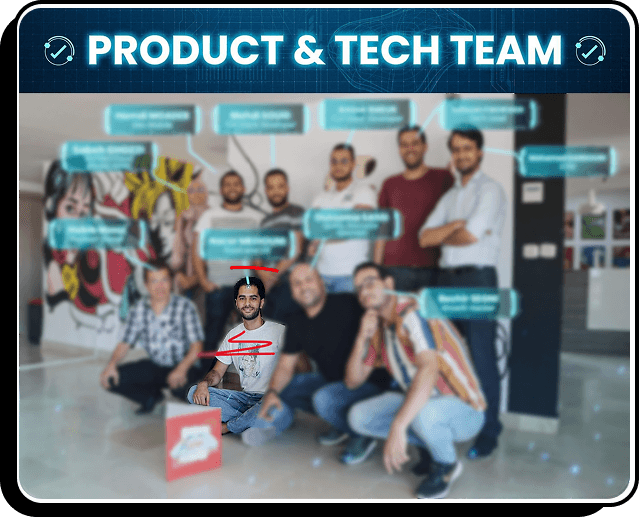
October 2021. I joined Tayara as UX Engineer just as the platform faced its biggest identity crisis. Within a lean team of 11 cross-functional members. My role often extended beyond traditional design into product strategy and stakeholder facilitation and even coding the Frontend.
03. Key Challenges

When Trust Breaks,
Everything Breaks


"Tayara is where everything is, but sometimes it feels like you need to be an expert just to understand how it works."
This single user quote haunted me for months.
Here was Tunisia's most beloved marketplace, a platform where millions bought cars, found homes, and built livelihoods, slowly hemorrhaging trust because we'd forgotten the human cost of complexity.
The Moment of Truth
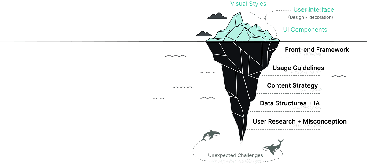
In Tayara's early years, posting an ad was simple: anyone could list as many cars, houses, or items as they wanted, completely free. But as the marketplace grew, so did the need for sustainability. Suddenly, unlimited listings in cars and real estate, Tayara's two most popular categories were no longer free. Users now needed tokens to publish beyond a limit, and boosting options were introduced to give ads more visibility.From a business perspective, this was a logical evolution. But for millions of users, it felt like the rules had changed overnight.
The problem wasn't just monetization. It was trust. Users didn't understand how boosts worked because they weren't explained anywhere in the app. Confusion turned into frustration, and frustration into mistrust , threatening both user experience and revenue growth.
My challenge was clear, rebuild Tayara's experience around clarity, transparency, and empowerment, so users felt informed, not tricked..
Understanding the Human Context
Tayara served a diverse population:
- Sellers of all kinds, from students listing their old phones, to professionals managing car dealerships, to families advertising homes.
- Buyers on a budget, seeking good local deals on everything from fashion to fridges.
- Job seekers, relying on Tayara to find their next opportunity.
- Real estate investors, browsing both secondhand homes and the new ImmoNeuf vertical.
One user summed up the frustration: "Tayara is where everything is, but sometimes it feels like you need to be an expert just to understand how it works."
The lack of clarity didn't just affect sellers , it eroded trust across the ecosystem. Buyers couldn't filter results effectively. Businesses weren't sure if Google Ads integration really added value. And as SEO declined, fewer users discovered listings organically.
Navigating Remote Work During COVID-19
The pandemic changed how we work, pushing us to adapt our workflow to a fully remote environment.
04. Process
Challenges Spark
Innovation
The Design Philosophy
We knew we couldn't just optimize flows in isolation. This was about reestablishing trust at scale.
My philosophy became:
Transparency over opacity. Users should always know what's free and what's premium.
Simplicity over clutter. Core tasks like searching, filtering, and publishing needed to feel effortless.
Empowerment over pressure. Premium services should be a choice, not a trick.
These principles shaped everything, from how we surfaced boosts, to how we displayed filters, to how we positioned ImmoNeuf as a distinct but integrated category.
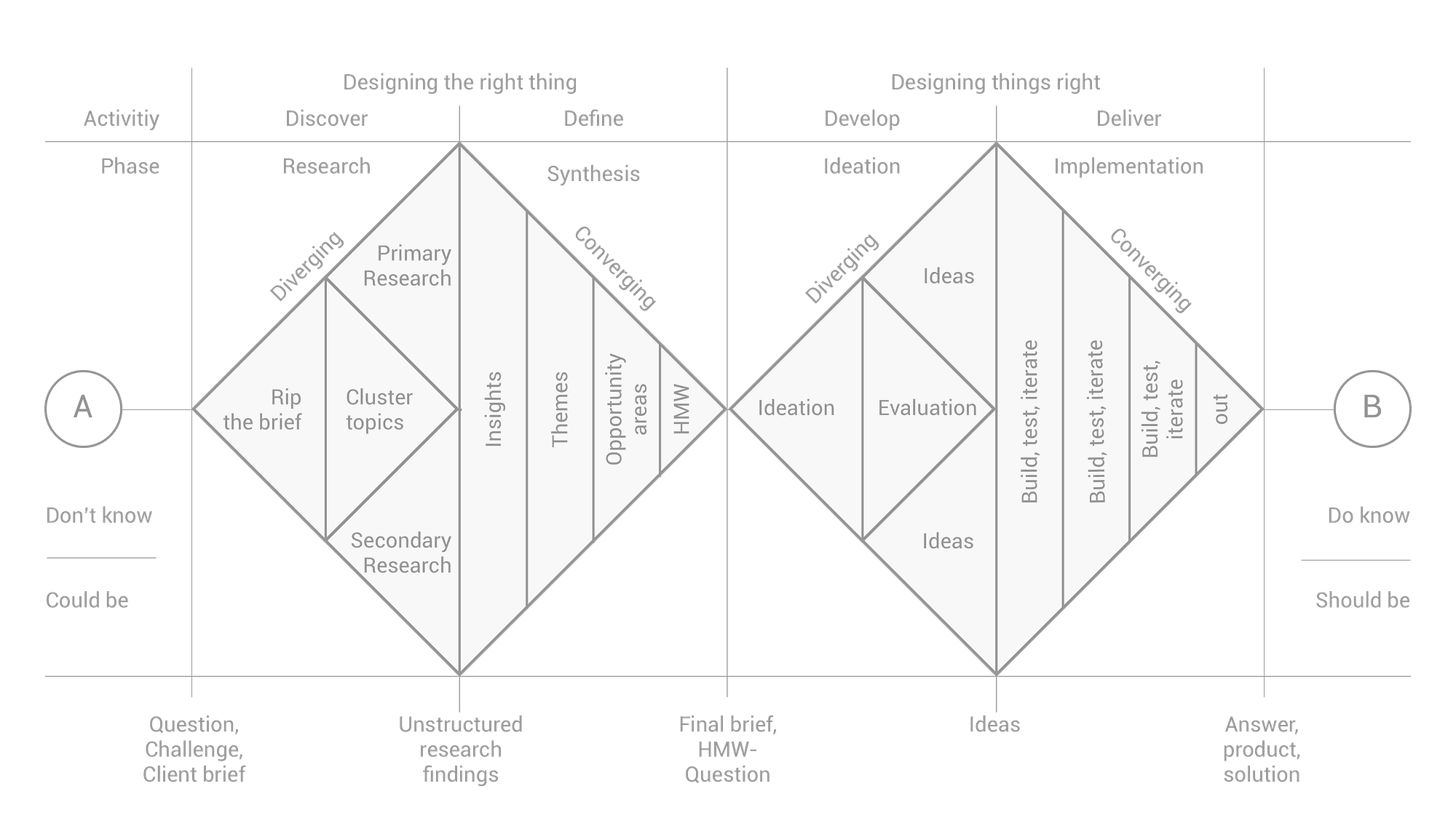
Process Overview
The Design Journey
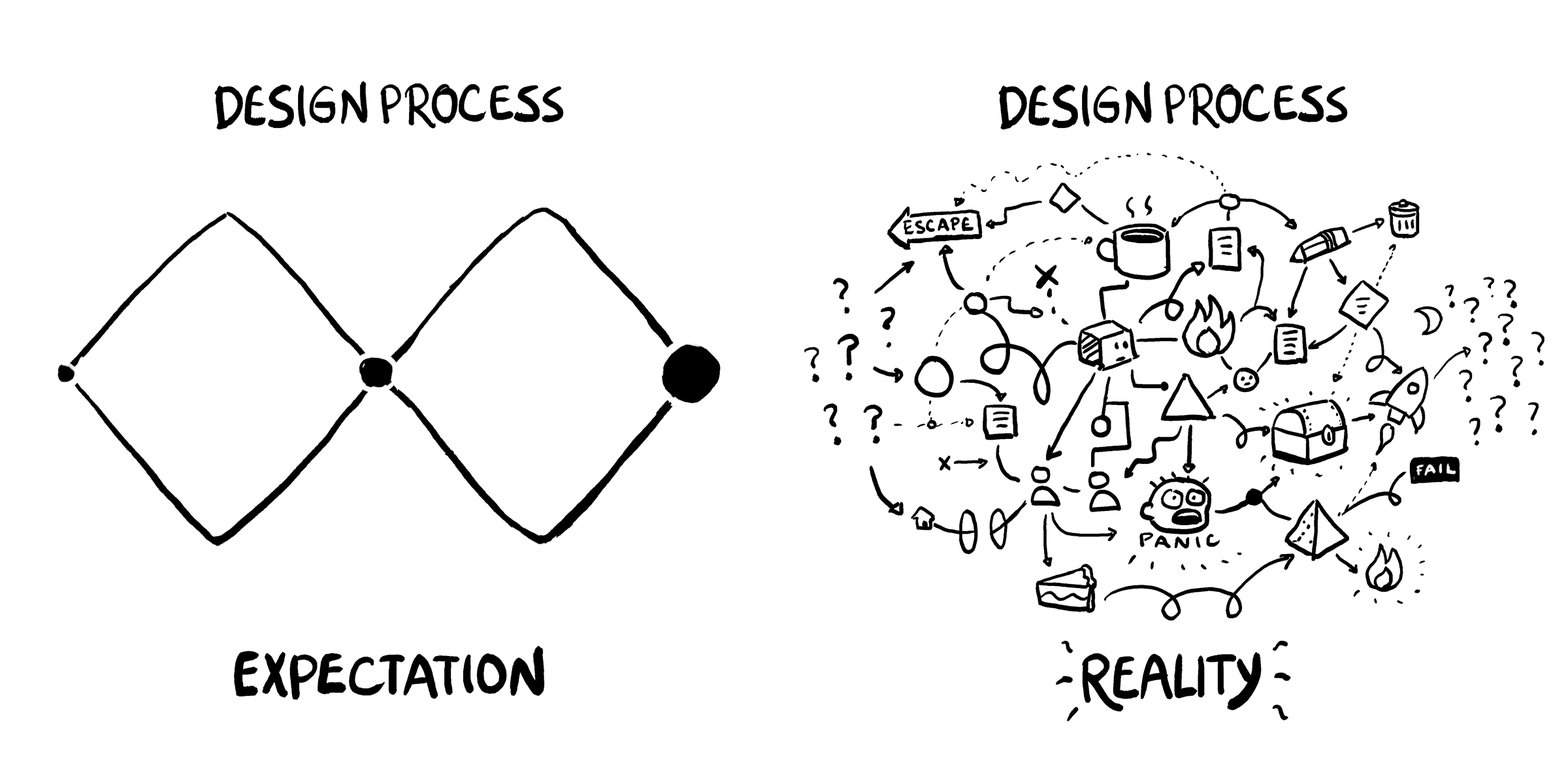
I started with research. I shadowed support calls with the sales and costumer support teams to analyze the drop-offs. The pain points were loud and consistent: unclear upsells, slow filtering, inconsistent layouts across devices, and underwhelming SEO discoverability.
My "Aha!" moment came when I realized the absence of explanation was the problem. Premium features weren't inherently bad, they were invisible, confusing, or misaligned with expectations.
This reframed my mission: every design improvement had to make the platform feel easier, clearer, and more trustworthy.
Challenge
Getting design approval was complex, involving Software Engineers, Product Owners, Tech Leads, Sales, and Marketing teams. The diverse feedback often added layers of complication and slowed innovation.
Solution
I developed stakeholder management principles to improve efficiency, enabling better time management and ensuring stakeholders receive maximum value with minimal time investment while maintaining design quality.
Stakeholder Management Principles
1
Transparency over opacity
Users should always understand what's free, what's premium, and exactly what premium gets them.
2
Simplicity over clutter
Core tasks like searching, filtering, and publishing must feel effortless.
3
Empowerment over pressure
Premium services should feel like tools for success, not barriers to basic functionality.
4
Research-driven decisions
Support design decisions with data and user research. Real examples make the difference.
5
Stakeholder alignment
Build relationships with key decision-makers and facilitate collaborative problem-solving.
6
Iterative improvement
Accept that not everything can be perfect. Prioritize by impact using frameworks like MoSCoW.
The Discovery Sprint Process
To tackle these challenges head-on, I developed the Discovery Sprint process a remote-friendly twist on the Google Design Sprint. This approach leverages asynchronous activities and digital tools to avoid the need for a full-week workshop. It ensures seamless collaboration across teams while fitting neatly into
everyone's schedules, even with the quirks of remote work.
Key Features
Fully Remote: Every aspect is handled remotely, no office required.
Efficient Meetings: We keep meetings under an hour to respect everyone's time.
Pre-Reading Provided: Materials are shared beforehand so the team hits the ground running.
Structured Presentations: Team members present their findings and recommendations in allocated slots, keeping things organised.
Task Assignments: We assign tasks to individuals or small groups, promoting ownership and efficiency.
05. Solution

Building Trust Through Clarity
We redesigned the entire marketplace experience around clarity
Homepage Redesign
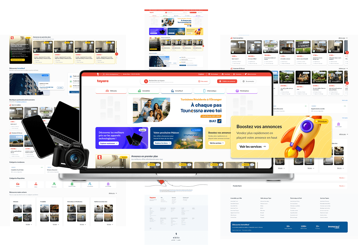
The homepage is the heart of Tayara's experience. But the old version was cluttered, slow, and disconnected from evolving business priorities.
I led the end-to-end redesign of the homepage for web and mobile web, introducing a clearer structure that responded directly to both user expectations and business goals:
- Highlighting priority categories like Cars and Real Estate.
- Surfacing premium placements (like "Boutique de la Semaine") in a more natural, less intrusive way.
- Improving entry points to core user journeys (post an ad, search, filter).
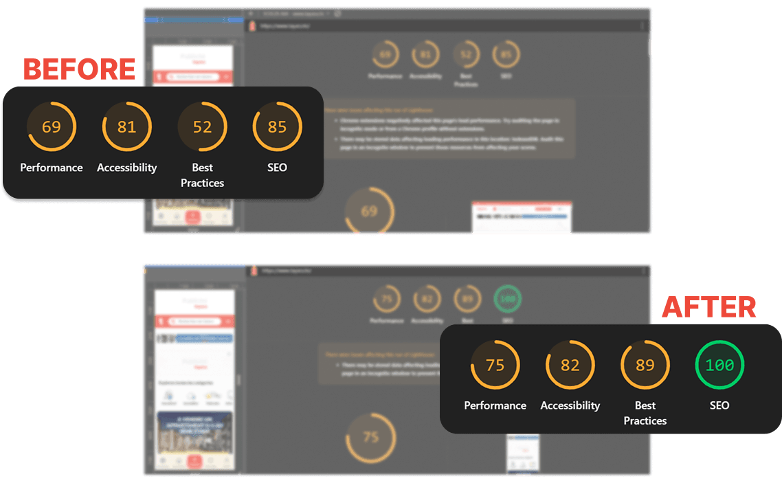
On the technical side, this redesign also became a lever for app performance optimization. Working closely with developers, I implemented responsive design principles, modular layouts, and accessibility best practices. These improvements directly impacted performance metrics, leading to a significant increase in Lighthouse scores across performance, accessibility, best practices, and SEO.
The result was not just a visual facelift, it was a strategic homepage that better served both buyers and sellers, while technically strengthening Tayara's ecosystem across web and app.
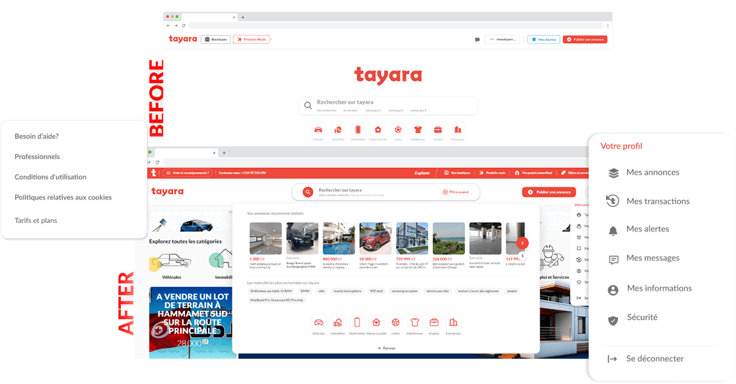
Responsive Navigation
The navigation header was rebuilt with a mobile-first design, ensuring consistency across devices. Using modular components in Figma and implementing them with Tailwind CSS and Next.js, I delivered a unified, scalable design system.
Offers & Services Page
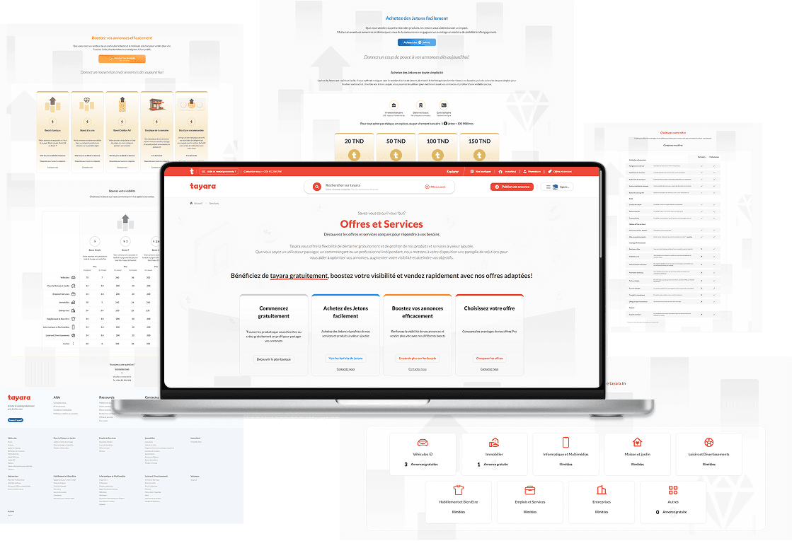
I designed and implemented a dedicated Offers & Services page that explained every premium option in plain language, with visuals and real examples.
- Boost Classique: Push your ad to the top of its category (Simple, 24h, or 7 days).
- Boost à la Une: Feature your ad in the top row of its category for one week.
- Boost Golden Ad: Pin your ad at the top of the category for one week.
- Boutique de la Semaine: Feature your entire shop on the homepage for one week.
- Boutique Recommandée: Highlight your shop logo in its category with a direct link.
By finally clarifying the differences, we turned boosting from a black box into a toolkit sellers could trust and choose with confidence.
ImmoNeuf Category
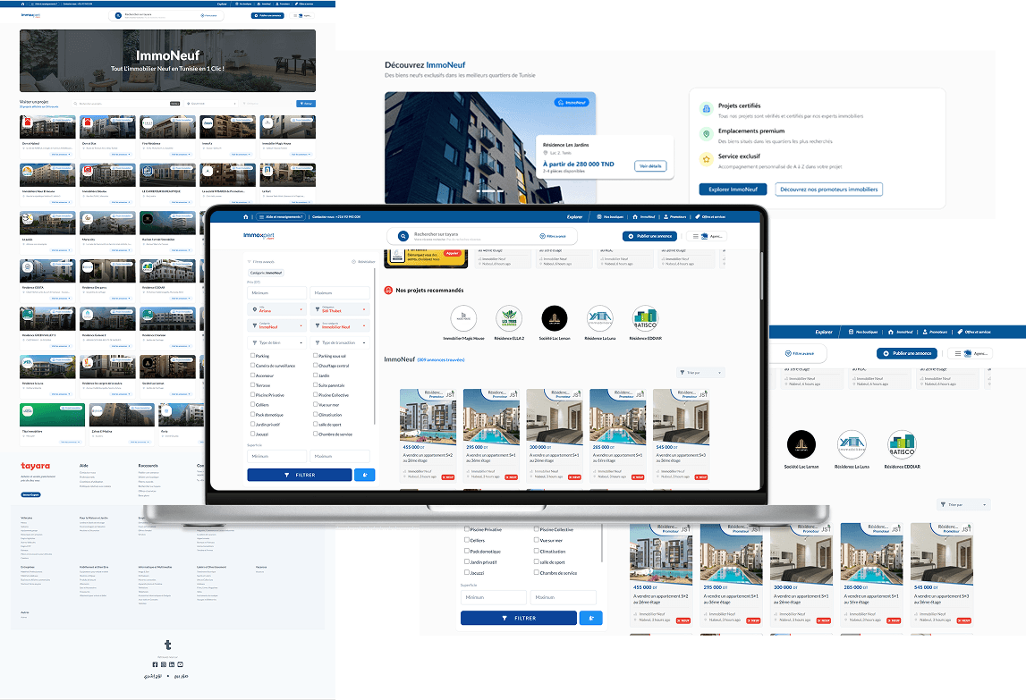
We launched ImmoNeuf, Tayara's new category for real estate developers. I designed an immersive browsing experience that highlighted new housing projects with rich visuals and clear navigation, making Tayara not just a resale platform, but also a destination for new builds.
Continuous SEO Improvements
Working with developers, I refactored content structures for semantic clarity, added microdata, and designed expandable sections that balanced SEO density with clean UI.
Result: stronger search visibility without sacrificing usability.
Each challenge required trade-offs. Marketing wanted boosts more prominent, while research showed trust dropped when upsells felt forced. SEO demanded content density, while design pushed for minimalism. Mobile responsiveness slowed development, so I led component modularization to accelerate implementation. The result was a set of balanced solutions that respected both user trust and business growth.
Building the Design System from the Ground Up
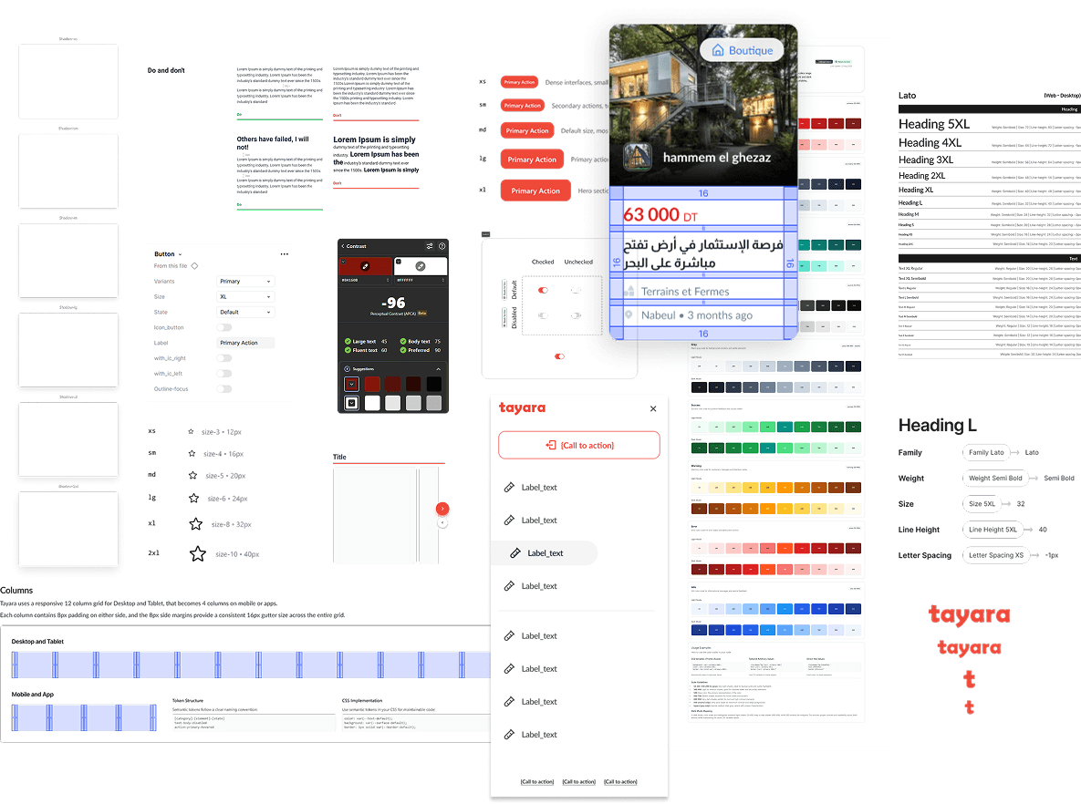
I created Tayara's first design system from scratch unified visual language, modular components, clear specifications, and optimized performance. This became the backbone of all subsequent development, reducing design-developer friction and ensuring consistent implementation across the platform.
The Design System
When I joined Tayara, the platform's components were inconsistent across pages and devices. Buttons, inputs, cards, and typography all had small variations, leading to a fragmented user experience and slowing down development.
I took the initiative to create a design system from scratch, aligned with the following goals:
1
Consistency
Ensure that all UI components across web and mobile share the same visual language, spacing, and interaction patterns.
2
Scalability
Build modular, reusable components that could grow with new features, categories, and premium options.
3
Developer-Friendly
Provide clear specifications, Figma variants, responsive guidelines, and Tailwind CSS-ready implementations for faster developer handoff.
4
Accessibility & Performance
Standardize accessibility practices and optimize component behavior to improve responsiveness and Lighthouse metrics.
By creating this foundation, I reduced design-developer friction, accelerated feature implementation, and ensured the new features could be deployed consistently and efficiently across the platform.
This design system became the backbone of Tayara's visual and functional identity, and it continues to guide all new product development.
06. Validation and impact

From confusion to Marketplace mastery
The redesign of Tayara wasn't just cosmetic, it delivered measurable results for both users and business, transforming confusion into clarity, frustration into trust.
The Numbers That Matter
The redesign and optimization efforts resulted in significant improvements across revenue generation, user engagement, and platform growth. These metrics demonstrate the tangible value of user-centered design and data-driven iteration.
Business Impact

More transactions
ImmoNeuf adoption boosted new real estate transactions on the platform.
Long-term impact
Sustained value creation through improved SEO, higher traffic, and better discoverability.
Improved conversions
Conversion rate improved due to clearer ad presentation and optimized flows.
Higher engagement
User engagement rose on homepage and ImmoNeuf category.
Revenue Growth
Premium boost adoption increased by 35%, generating more revenue from token sales.
User Experience Metrics
~30%
faster ad publishing thanks to clearer flows
~25%
Satisfaction scores increased by 25% on premium services
~40%
Filter success rate improved, helping users find listings 40% faster
~60%
Support tickets around boost confusion dropped by 60%
Real Users, Real Results
After launching the Offers & Services page, users finally understood premium boosts and tokens. Boost adoption increased as sellers could make informed choices, and support tickets related to ad visibility and boost confusion dropped dramatically
The homepage redesign created a seamless first experience for buyers and sellers alike, highlighting key categories, surfacing premium features naturally, and aligning with business goals. On the technical side, the redesign drove significant performance improvements, increasing Lighthouse scores across performance, accessibility, SEO, and best practices, creating value for both web and mobile app platforms.
Filtering and sorting optimizations reduced search friction, helping buyers find relevant listings faster and increasing engagement. The launch of the ImmoNeuf category expanded Tayara's real estate offerings, attracting new users and boosting high-value transactions.
Before vs. After
Before the redesign, users struggled with invisible premium options, confusing ad limits, and clunky search. After, Tayara became transparent, responsive, and user-focused, with measurable improvements in adoption, engagement, and trust.
Most importantly, users told us: "Tayara feels easier now. I know what I'm doing." That emotional shift , from confusion to clarity , was the real success.
07. Closing
The Final Call
Lessons Learned
This project taught me that marketplaces are systems of trust. Every unclear upsell, every broken filter, every unresponsive page erodes confidence. By solving these systemic issues, we weren't just polishing UI, we were strengthening Tayara's role as Tunisia's most trusted classifieds platform.
Embracing Unconventional Approaches: Exploring UX anti-patterns and non-traditional design methods led to fresh solutions.
Stakeholder Management: Managing multiple stakeholders required significant effort but was crucial in keeping the project on track.
For the Greater Good: We recognised the need to make decisions for the bigger picture, even if it means scrapping our hard work.
Personally, I grew in stakeholder management. Balancing SEO with design simplicity, monetization with user trust, and responsiveness with developer workload required constant negotiation and empathy.
If I could start over, I'd invest earlier in a shared design system to accelerate alignment.
The Future of Trust
Tayara's evolution isn't over. Future opportunities lie in personalized seller insights, AI-driven filtering, and expanding specialized verticals beyond ImmoNeuf.
For me, the project reinforced my passion for making complex ecosystems feel simple and transparent. Marketplaces succeed when they empower people, and that's the kind of impact I aim to create.
Ready to build human-centered platforms that scale?
I'd love to discuss how transparency and clarity can drive both user satisfaction and business growth.
Portfolio piece completed: 3-year redesign of Tunisia's #1 marketplace, serving millions of users across multiple categories and device types.

Designed and built by me © 2026 All rights reserved.